Differential Abundance Analysis
Statistical analysisThe aim of differential abundance (DA) analysis is to statistically compare the repartition of cell populations defined by clustering between conditions. Several methods are available, some inspired from flow cytometry analysis, others designed for scRNA-seq data. The DA analysis provided in this module is based on the NB GLM methods implemented in the edgeR package.
Module specifications
| Input data | Computationnal environnement | Output data |
|---|---|---|
|
annotated data matrices |
scRNA-seq_data_analysis R |
differential analysis table |
Code
This module is based on the following documentation :
EdgeR R package
Robinson MD, McCarthy DJ, Smyth GK. edgeR: a Bioconductor package for differential expression analysis of digital gene expression data. Bioinformatics. 2010 Jan 1;26(1):139-40. doi: 10.1093/bioinformatics/btp616
Chen Y, Lun AT, Smyth GK. From reads to genes to pathways: differential expression analysis of RNA-Seq experiments using Rsubread and the edgeR quasi-likelihood pipeline. F1000Res. 2016;5:1438. Published 2016 Jun 20. doi:10.12688/f1000research.8987.2
Chen Y, Chen L, Lun AT, Baldoni PL, Smyth GK. edgeR v4: powerful differential analysis of sequencing data with expanded functionality and improved support for small counts and larger datasets. bioRxiv 2024.01.21.576131; doi: https://doi.org/10.1101/2024.01.21.576131
Guidelines for scRNA-seq differential abundances
Yi H, Plotkin A, Stanley N. Benchmarking differential abundance methods for finding condition-specific prototypical cells in multi-sample single-cell datasets. Genome Biol 25, 9 (2024). doi.org/10.1186/s13059-023-03143-0
* https://genomebiology.biomedcentral.com/articles/10.1186/s13059-023-03143-0
Amezquita RA, Lun, AT, Becht E et al. Orchestrating single-cell analysis with Bioconductor. Nat Methods 17, 137–145 (2020). doi.org/10.1038/s41592-019-0654-x
Chapter 6 : Changes in cluster abundance
* https://bioconductor.org/books/3.13/OSCA.multisample/differential-abundance.html
This module require to load the following environment of R packages :
source("/home/truchi/Starter_pack.R")
Informations about the demo dataset :
The demo dataset is a collection of 18 public 10X Genomics Chromium samples (GSE151374) of control (n=6) or bleomycin-treated mice lungs (n=12), collected after 7 or 14 days following treatment. Half of bleomycin-treated mice were also treated with Nintedanib, an anti-fibrotic drug which slows lung function decline and prolongs survival of patients (see associated publication).
This dataset has already been processed (see the "Integration of multiple scRNA-seq samples" module) and annotated (see the Cell annotation module).
Bleomycin is inducing reversible lung fibrosis, which peaks around 14 days after an inflammatory phase. It notably induces recruitment of monocyte-derived alveolar macrophages and a phenotypical switch of tissue-resident alveolar macrophages.
The precise mode of action of Nintedanib is not fully understood, as it inhibits more than 30 tyrosine kinases, notably growth factor receptor signaling involved in pathological fibroblast proliferation.
The authors of the study associated to this dataset show that nintedanib also modulates the phenotype of alveolar macrophages, which play a key role in the pathology.
In this module, we will show how to detect, evaluate and represent the effects of Nintedanib on the repartition of myeloid subpopulations using differential abundance analysis.
Notes
By analogy with the differential expression analysis, it models overdispersed numbers of cells per population and then tests for abundance differences between groups with the glmQLFTest function, which performs empirical Bayes quasi-likelihood F-tests and FDR controlling.
This method fits well to leverage on multi-samples datasets with biological replicates. For datasets with few or no replicates, methods such as milo (https://marionilab.github.io/miloR/articles/milo_demo.html) should be more appropriate.
When carrying out a differential abundance analysis, one should always be aware that the observed cell proportions are dependent on the sampling method and dissociation conditions, and therefore only represent an approximation of the true cell composition.
1. Load a scRNA-seq dataset and visualize cluster repartition
Here we load the seurat object saved after integration of 18 lung samples from PBS or bleomycin-treated mice, and cell population annotation.
aggr <- readRDS("/data/analysis/data_truchi/GSE151374.rds")
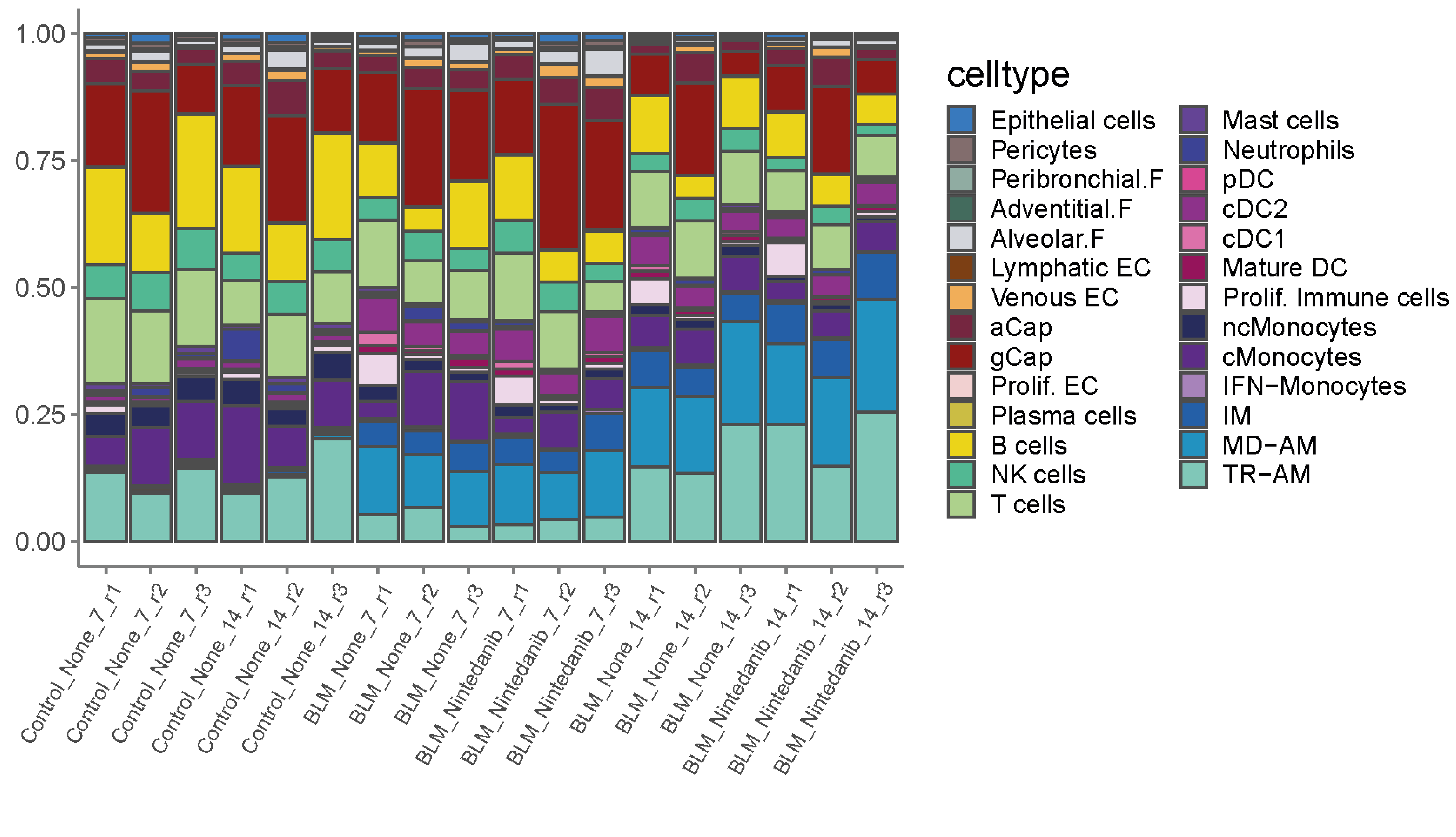
As a first overview of cluster repartition between samples and conditions, we plot the relative frequencies of all population in all samples.
# First, we load the color code of all annotated populations and extract the number of cells per cluster and per sample
colors.Bleo<- c("TR-AM"="#7FCDBB","MD-AM"="#1D91C0","IM"="#225EA8","IFN-Monocytes" = "#aa83c7","cMonocytes"="#66119c","ncMonocytes"="#282b5c","Prolif. Immune"="#f0d8ee",
                "Mature DC"="#960c5a","cDC1"="#e670b4","cDC2"="#9c119c","pDC"="#de439a","Neutrophils"="#4300de","Mast cells"="#9315ed",
                "T cells"="#ADDD8E","NK cells"="#46c798","B cells"="#ebd513","Plasmocytes"="#ccbf47",
                "Prolif. EC"="#f2d0d0","gCap"="#911414","aCap"="#752740","Venous EC"="#f2ae5a","Lymphatic EC"="#7d3f15",
                "Alveolar.F"="#d3d5db","Adventitial.F"="#436b5d","Peribronchial.F"="#90ada3","Pericytes"="#806c6c","Epithelial cells"="#1486f7")
celltype_order <- names(colors.Bleo)

metadata <- aggr@meta.data %>% filter(celltype %in% celltype_order) #add data into metadata in which celltype and celltype_order matches with each other.
metadata$celltype <- factor(metadata$celltype, levels = celltype_order)
metadata = as.data.frame.matrix(table(metadata$sample, metadata$celltype))

# Then, we compute the relative proportions and we order the samples to visualize clearly control, bleomycine and nintedanib conditions.
metadata = as.data.frame(metadata / rowSums(metadata)) #normalization
metadata$sample = rownames(metadata) #add a new column
sample.order <-c("Control_None_7_r1","Control_None_7_r2","Control_None_7_r3",
  "Control_None_14_r1","Control_None_14_r2","Control_None_14_r3",
  "BLM_None_7_r1","BLM_None_7_r2","BLM_None_7_r3",
  "BLM_Nintedanib_7_r1","BLM_Nintedanib_7_r2","BLM_Nintedanib_7_r3",
  "BLM_None_14_r1","BLM_None_14_r2","BLM_None_14_r3",
  "BLM_Nintedanib_14_r1","BLM_Nintedanib_14_r2","BLM_Nintedanib_14_r3")
metadata$sample =factor(metadata$sample, levels = sample.order)

# This line selects the column corresponding to populations and convert the table into a 3 columns dataframe (sample, population, proportion)
metadata = gather(metadata, celltype, percentage, "TR-AM":"Epithelial cells")
metadata$celltype <- factor(metadata$celltype, levels =rev(celltype_order))

# It's possible to represent only a subset of populations, by executing the following line
# metadata <- metadata %>% filter(celltype %in% c("Proliferating cells","AM1","AM2","AM3","IM"))
# Otherwise, just execute this :
ggplot(metadata, aes(x = sample, y = percentage, fill = celltype)) +
  geom_bar(stat = 'identity', color = "grey30") +
  scale_fill_manual(values = colors.Bleo) +
  ggtitle("Relative proportions")+
  theme_classic() +
  theme(axis.text.x = element_text(size = 10, angle = 45),
        axis.title.y = element_blank(),
        axis.title.x = element_text(size =14),
        axis.text.y = element_text(size = 10),
        axis.line = element_line(colour = "grey50"),
        axis.ticks = element_line(colour = "grey50"),
        legend.text = element_text(size = 12),
        legend.title = element_text(size = 14))

2. Perform differential abundance analysis and represent the results
This function performs differential abundance test using edgeR. It requires a seurat object, the name of the column containing the conditions and a list of pairs of condition to compare.
DA_edgeR <- function(dataset,contrast_var,group_pair){
  Idents(dataset) <- contrast_var
  sub <- subset(x=dataset,idents= group_pair)
  abundances <- table(sub$celltype, sub$identifier)
  abundances <- unclass(abundances)
  head(abundances)

  metadata <- sub@meta.data %>% dplyr::select(all_of(contrast_var),"identifier") %>% unique()
  metadata$group <- metadata[,contrast_var]

  y.ab <- DGEList(abundances, samples=metadata)
  y.ab

  keep <- filterByExpr(y.ab, group=y.ab$samples$group,min.count = 2, min.total.count = 1, large.n = 1, min.prop = 0.1)
  summary(keep)
  y.ab <- y.ab[keep,]
  summary(keep)

  design <- model.matrix(~factor(group), y.ab$samples)
  y.ab <- estimateDisp(y.ab, design, trend.method="none")
  summary(y.ab$common.dispersion)

  fit.ab <- glmQLFit(y.ab, design, robust=TRUE, abundance.trend=FALSE)
  summary(fit.ab$var.prior)

  res <- glmQLFTest(fit.ab, coef=ncol(design))
  summary(decideTests(res))

  table <- topTags(res, n = dim(res)[1]) %>% as.data.frame() %>% mutate(test=paste0(group_pair[1],".vs.",group_pair[2]),celltype=rownames(.))
  table
}
The seurat object must contain an "identifier" column that corresponds to the individual sample, and a "celltype" column that corresponds to the cell annotations.
# Define your identifier, and your "celltype" column
aggr$identifier <- aggr$sample
aggr$celltype
Here, we run the function on a subset of myeloid celltypes and we compare CTRL vs Bleomycin samples, as well as Bleomycin with or without Nintedanib, at day 7 and day 14. The output will be a list where each element is a differential abundance table of each cell population for a particular contrast.
# Decide which subset to work on (it can be the full dataset)
celltypes <- c("TR-AM","MD-AM","IM","cMonocytes","ncMonocytes","Mature DC","cDC1","cDC2")
sub <- subset(aggr,subset = celltype %in% celltypes)

# Define the contrasts list
contrasts <- list("CTRLvsBLMd7"=c("CTRL","BLM_None_d7"),"CTRLvsBLMd14"=c("CTRL","BLM_None_d14"),"BLMvsNintedanib_d7"=c("BLM_None_d7","BLM_Nintedanib_d7"),"BLMvsNintedanib_d14"=c("BLM_None_d14","BLM_Nintedanib_d14"))
DA_table <- lapply(X=contrasts,FUN = DA_edgeR,dataset=sub,contrast_var="group")
names(DA_table) <- names(contrasts)

# Save the differential abundance list in an excel file
write.xlsx(DA_table,file = "AM_DA.xlsx")
As an example, show the differential abundance table obtained by comparing bleomycin samples treated or not with Nintedanib.
DA_table[["BLMvsNintedanib_d14"]]

                  logFC   logCPM          F      PValue         FDR                               test    celltype
cDC1        -1.65474059 13.42166 14.8094132 0.001128722 0.006170668 BLM_None_d14.vs.BLM_Nintedanib_d14        cDC1
ncMonocytes -1.05098463 14.75207 13.7624241 0.001542667 0.006170668 BLM_None_d14.vs.BLM_Nintedanib_d14 ncMonocytes
Mature DC   -0.91401128 14.14362  8.3188329 0.009683291 0.025822109 BLM_None_d14.vs.BLM_Nintedanib_d14   Mature DC
cMonocytes  -0.53583263 16.70346  5.2678658 0.033609362 0.067218725 BLM_None_d14.vs.BLM_Nintedanib_d14  cMonocytes
cDC2        -0.36122911 16.04742  2.1268834 0.161504581 0.225366558 BLM_None_d14.vs.BLM_Nintedanib_d14        cDC2
IM           0.37299912 16.07470  2.0485911 0.169024918 0.225366558 BLM_None_d14.vs.BLM_Nintedanib_d14          IM
TR-AM        0.23861621 18.36862  1.1505268 0.297232757 0.339694579 BLM_None_d14.vs.BLM_Nintedanib_d14       TR-AM
MD-AM        0.08329709 18.48284  0.1676749 0.686888950 0.686888950 BLM_None_d14.vs.BLM_Nintedanib_d14       MD-AM
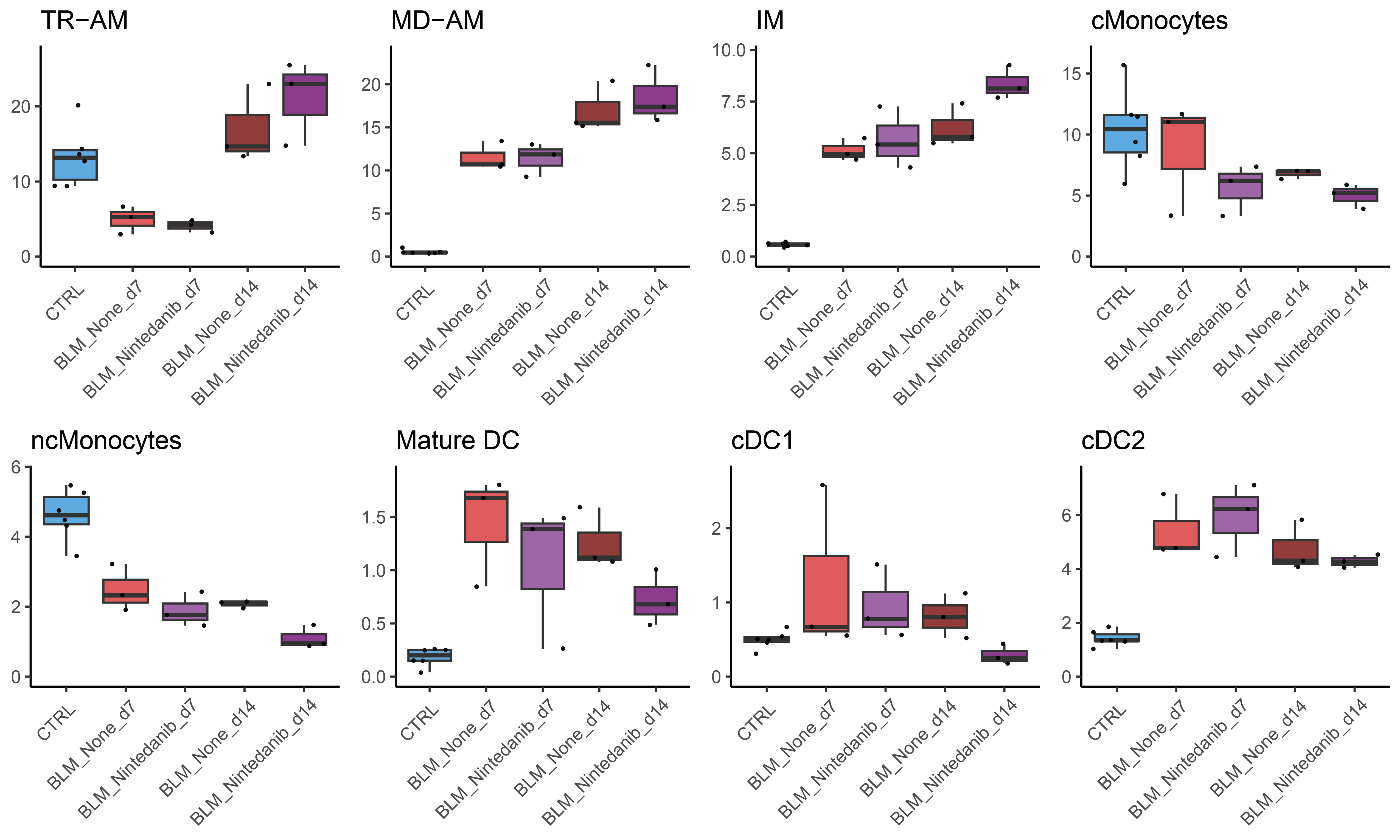
To represent the results, the relative proportion of each population can be visualized as boxplots.
# Colors for boxplots
group.colors <- c("CTRL"="#5cabe0","Control_None_d14"="#3c6791","BLM_None_d7"="#e05c5c","BLM_Nintedanib_d7"="#ca5ce0","BLM_None_d14"="#913c3c","BLM_Nintedanib_d14"="#8e3c91")
# Order of boxplots
group_order <- levels(aggr$group)

# This function outputs a list of boxplots corresponding to each population
plot_relfreq_list <- lapply(celltypes, function(celltype) {
  y.lim <- max(get_relFreqs(aggr, grouping = "group") %>% mutate(value=round(value*100,digits = 2))%>% filter(cluster == celltype) %>% pull(value))
  p <- plot_relFreqs(freqs=get_relFreqs(aggr, grouping = "group") %>% mutate(value=round(value*100,digits = 2)),
                     clust=celltype, cols=group.colors, order=group_order, title = celltype, save = F)+
    ylim(0, y.lim+(0.05*y.lim))+
    theme_classic()+ggtitle(celltype)+
    theme(axis.title.x = element_blank(),axis.text.x = element_text(angle = 45,vjust = 0.85,hjust = 0.85))
  p
})
names(plot_relfreq_list) <- celltypes

# Plot the relative abundances of selected populations together
plot.1 <- ggarrange(plot_relfreq_list[["TR-AM"]],plot_relfreq_list[["MD-AM"]],plot_relfreq_list[["IM"]],plot_relfreq_list[["cMonocytes"]],
                    plot_relfreq_list[["ncMonocytes"]],plot_relfreq_list[["Mature DC"]],plot_relfreq_list[["cDC1"]],plot_relfreq_list[["cDC2"]],nrow = 2,ncol = 4)
plot.1
The FDR value corresponding to each contrast can be automatically drew in the R code. However, as there are multiple values to plot, the positionning of the containing bracket must be manually defined for each plot. A more convenient way to proceed is to print the boxplot without the FDR values, and add them later using image editing software.


